La Crosse Area Community Foundation: New Name, New Look
June 17, 2024
 | By Jamie Schloegel, Chief Executive Officer |
 La Crosse Community Foundation becomes La Crosse Area Community Foundation
Much like when you encounter an old friend who looks refreshed and rejuvenated but you can’t quite pinpoint what’s different, our updated name and look carry a similar subtle yet weighty message. Our new name, tagline, and logo may seem like small changes at first glance, but they reflect a deeper evolution.
The new look captures our ongoing commitment to progress and inclusivity and represents our community’s vibrant, dynamic spirit. Just as a slight change in appearance can indicate a renewed energy and direction in a person, our rebranding signifies our dedication to meeting changing needs while continuing our commitment to the foundation’s mission and the communities it serves.
Why a name change?
Our new name, La Crosse Area Community Foundation, emphasizes that we serve not only the city of La Crosse but also the greater La Crosse area, including all of La Crosse County. This change highlights our dedication to all the communities within our region.
Investing in communities. For good. Forever.
Our updated tagline — “Investing in communities. For good. Forever.” — more clearly describes our mission. La Crosse Area Community Foundation is dedicated to investing in the well-being and development of our communities, ensuring that our efforts create lasting, positive impacts.
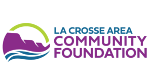
La Crosse Area Community Foundation logo symbolizes growth and continuity
La Crosse Area Community Foundation’s refreshed logo retains the iconic imagery of the Mississippi River and bluffs, depicting the area we serve. But the logo has been flipped horizontally to depict the Mississippi River flowing to the right. It demonstrates our forward-looking approach and the continuous impact of foundation donors and area nonprofit organizations as they feed communities, populations, and generations downstream or yet to come.
The logo also incorporates multiple colors from our brand palette rather than a single color, as in the past. Each color’s application to the logo was intentional.
![]()
Our rainbow of colors, which also includes orange, red, and brown, symbolizes the diversity within our community — the various nonprofit organizations and the range of needs they address, the different passions of donors, and the assortment of people who call this area home. The rainbow is also an inclusive symbol, illustrating that there is room for everyone here. Each color complements the others, just as each entity in our community contributes to the greater good.
Evolving with the times and the community
These changes modernize our appearance and better represent the vibrant, diverse, and inclusive nature our community can embody. They show the direction in which we’re growing and what we’re working to become. It’s an effort that welcomes, perhaps even requires, all to participate.